
Typographic Poster: Moon Landing
This assignment was given during my first typography class. We needed to create a type only poster and select a historic event in history to design around. I chose the moon landing in 1969. As with many projects, I started off with thumbnails for brainstorming.
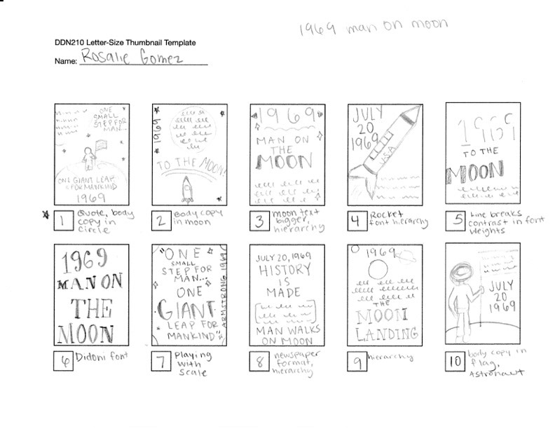
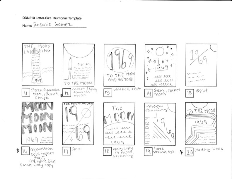
While I originally wanted to add in some graphical elements, I wanted to ensure that the type was the real star. I didn't want to minimize the importance of the typography for this design. I played around with a couple of different concepts before deciding on a design that showcased repetition, and a bold font face for visual interest.

I settled on this final design, with the repetitive moon text fading into the background as it progressed down the poster. I also went for a "groovy" or "psychedelic" color palette, with the neon green against the light purple color as an ode to the psychedelic 60's. I wrote a research paper about psychedelic art during this class, so I was heavily inspired by that. While this design was okay, I can see the mistakes that I made now. I knew this design would be a good candidate for a redesign in my current class.
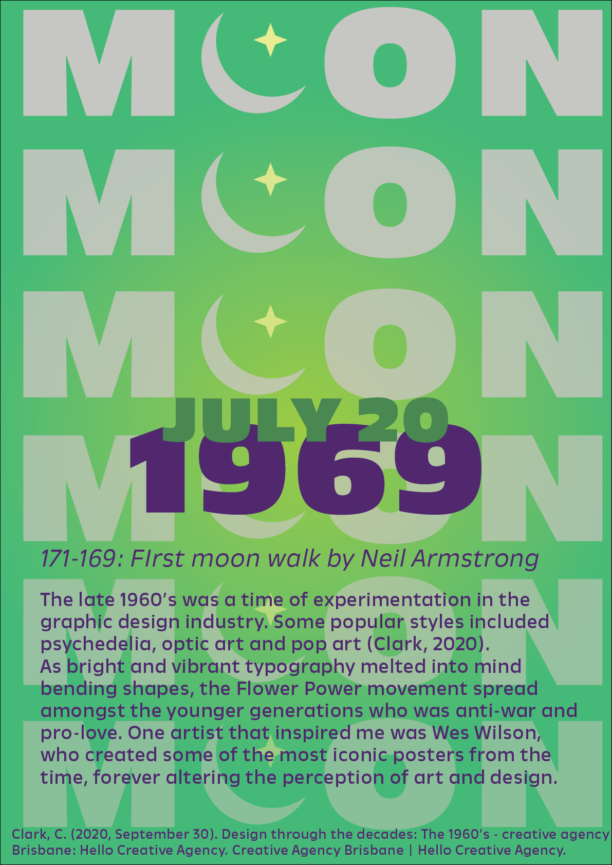
For my redesign, I decided to change the color scheme to teal and purple. I wanted to also include a small visual element, which can be seen by the first "O" being replaced by a crescent moon and star. I chose a bolder font face for this design and moved away from the psychedelia I tried to showcase in the original design.