
Iconography & Landing Page Design
This was a two part project that started with designing icons for a fictional technology company, Pear Technologies. This project showcases my ability to wireframe, create icons and create a landing page.
Pt. 1 - Iconography
I began by sketching out some icons for each necessary function, such as mail, maps, user, call and cart. I selected the best one out of each design and began working in Illustrator to refine my 25 icons.
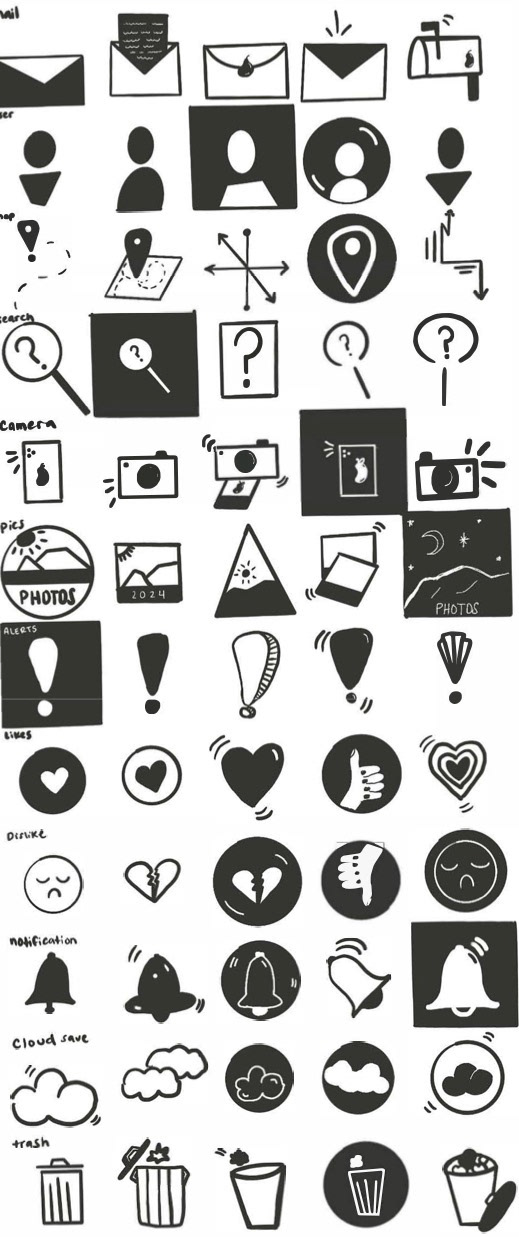
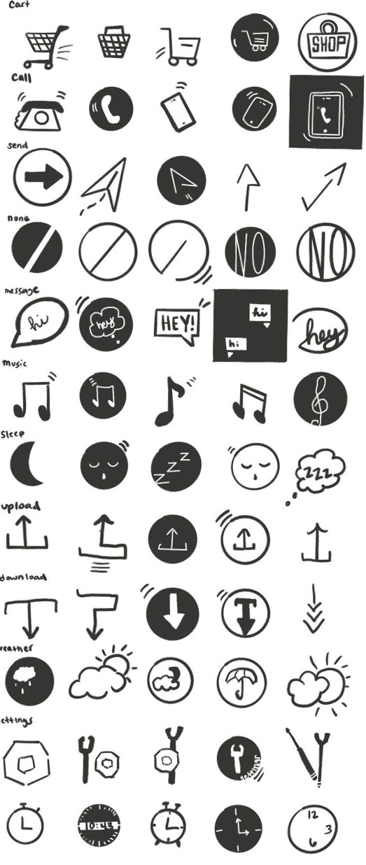
Final icons:

Pt. 2: Landing Page Design
Moving on to the next assignment, we had to create a landing page for our icons. I sketched out a couple of layouts before creating some low fidelity wireframes.

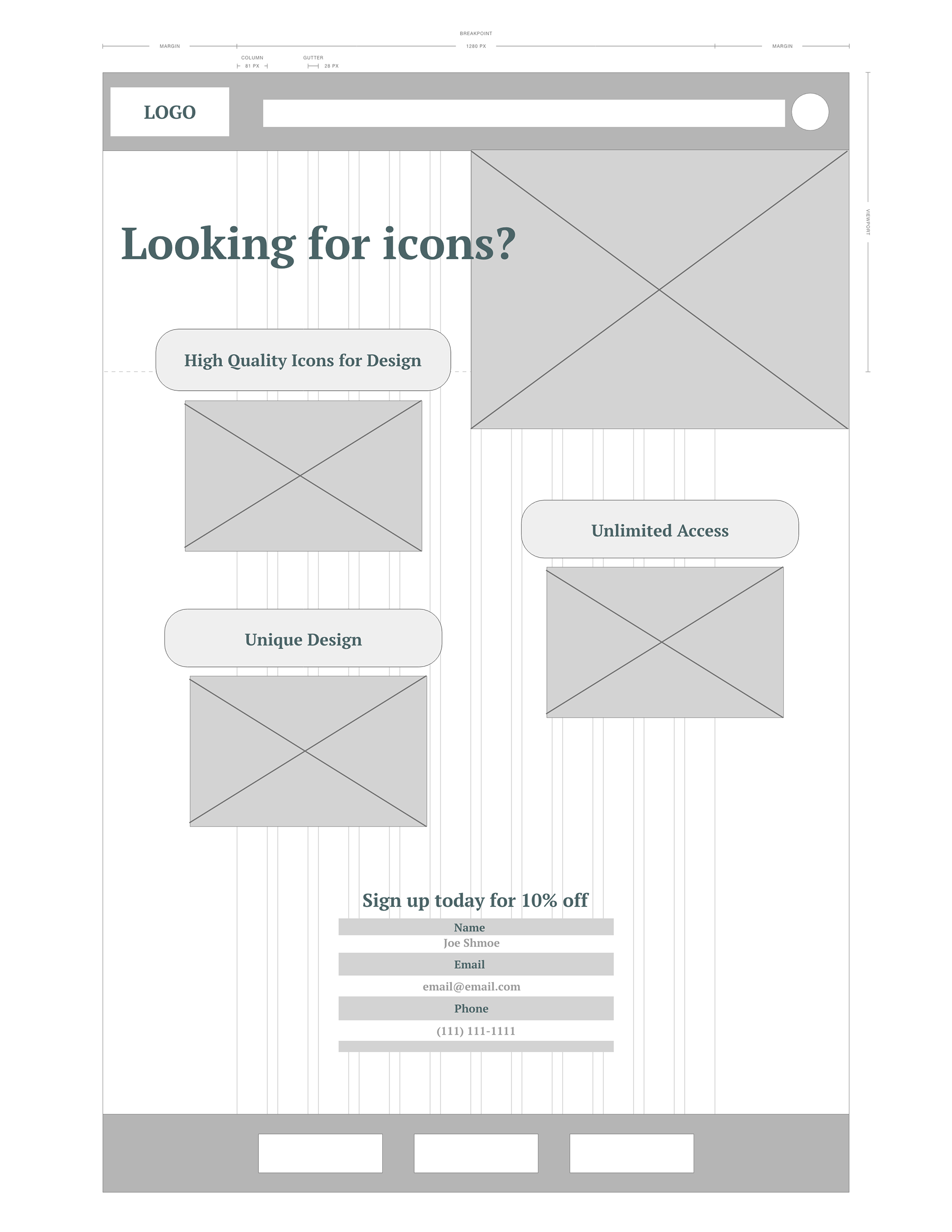
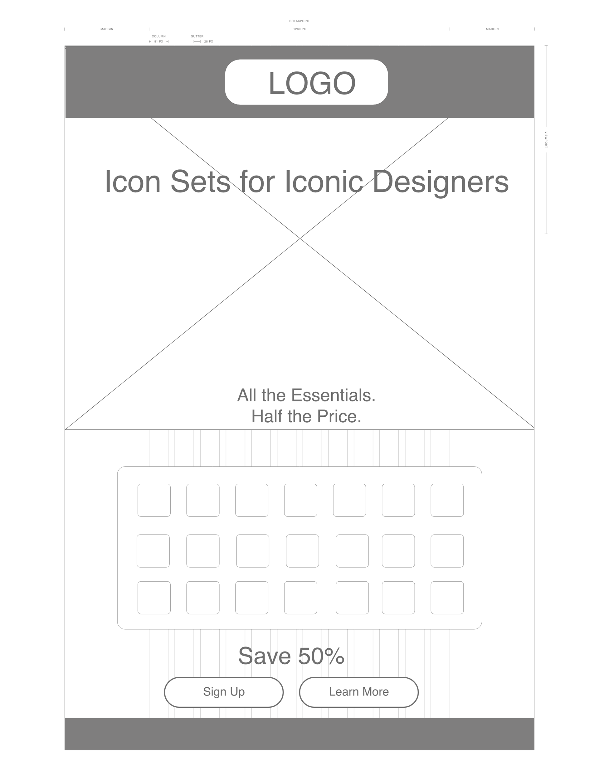
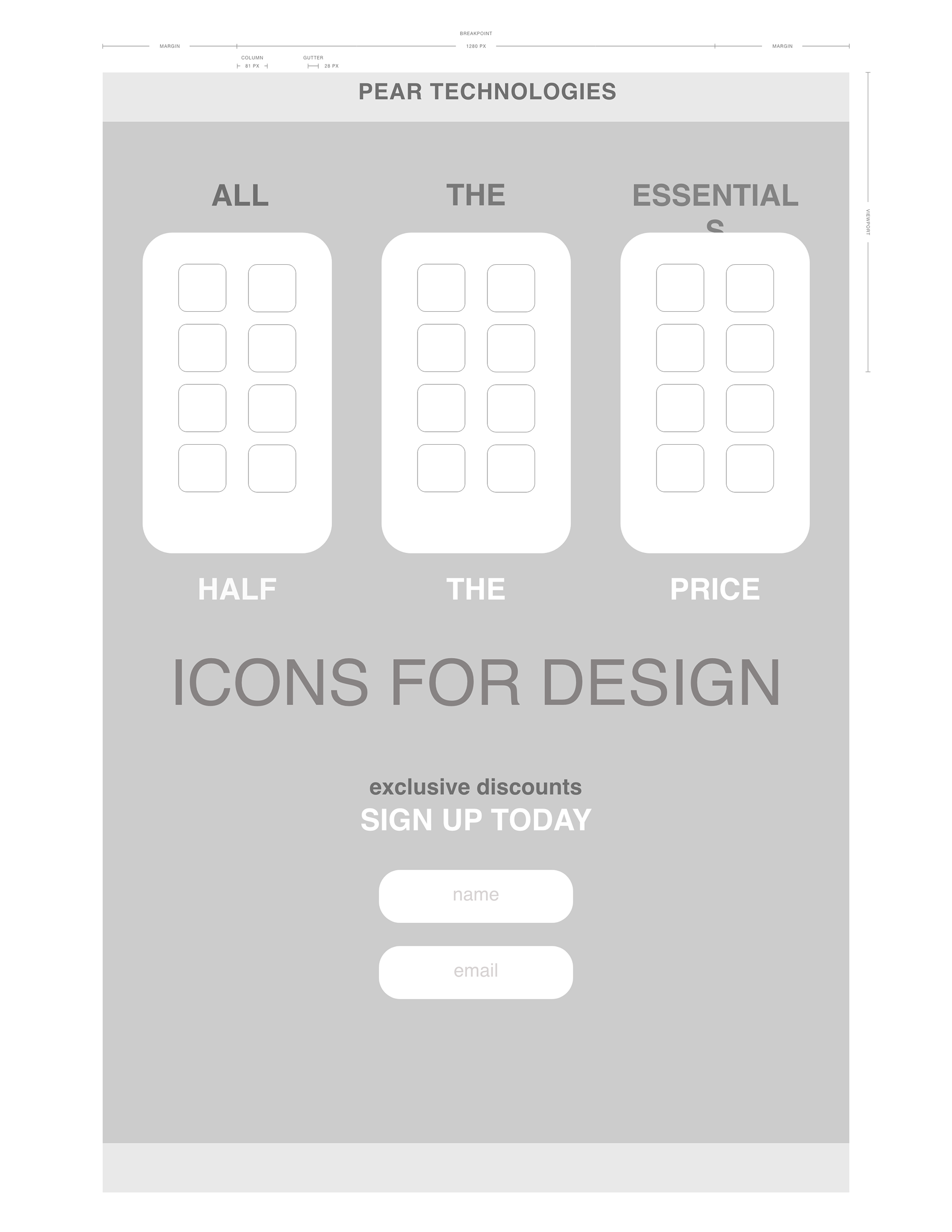
Moving forward, I selected the best layout and began laying out my elements onto the page. I decided on a dark color scheme for this landing page. This project needed to have a registration box and some buttons to meet the assignment requirements.
Final Design:
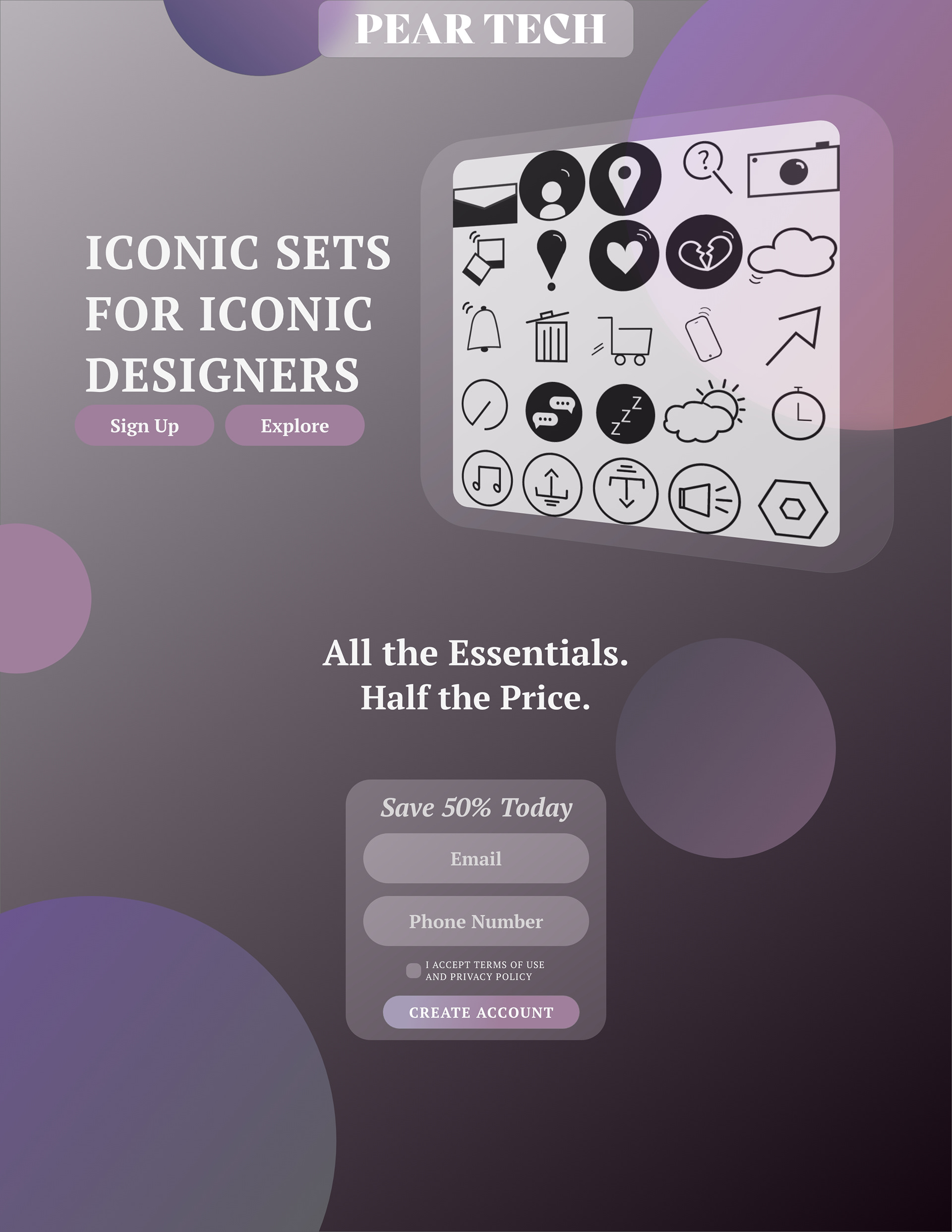
I used a background blur on my registration box and beneath the icons to create some visual interest. I created a simple tagline and call to action to entice the viewer to sign up and save.